How Page Layout Affects SEO: The Ultimate Guide
How Page Layout Affects SEO: The Ultimate Guide to Ranking Higher in 2025
Page layout isn't just about aesthetics—it's a critical ranking factor that directly impacts your website's search engine performance. Google's algorithms have evolved to prioritize user experience, and your page layout sits at the intersection of technical SEO, user engagement, and conversion optimization.
In this comprehensive guide, we'll explore how strategic page layout decisions can dramatically improve your search rankings, increase dwell time, and reduce bounce rates.
Understanding the Page Layout Algorithm Update
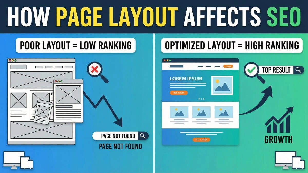
Google's Page Layout Algorithm, first introduced in 2012 and continuously refined, penalizes websites that push content below the fold with excessive ads or promotional material. This update fundamentally changed how we approach above-the-fold content strategy.
The algorithm evaluates the ratio of visible content to advertisements when a page first loads. Websites that prioritize user experience by displaying valuable content immediately tend to rank higher in search results. This is why understanding Core Web Vitals has become essential for modern SEO strategies.
Why Google Cares About Page Layout
Search engines aim to deliver the best possible user experience. When visitors land on a page cluttered with ads, pop-ups, or disorganized content, they're more likely to bounce back to search results. This signals to Google that your page didn't satisfy the user's intent.
According to research from the Nielsen Norman Group, users typically scan web pages in an F-shaped pattern, focusing on the top and left portions of the page. Strategic page layout leverages this behavior to improve engagement metrics that influence rankings.
Critical Page Layout Elements That Impact SEO
1. Above-the-Fold Content Optimization
The content visible without scrolling determines your first impression and significantly influences bounce rate. Google's algorithms assess whether users can immediately access valuable information.
Best practices for above-the-fold optimization:
- Place your primary heading (H1) in the visible area immediately
- Include compelling introductory content that matches search intent
- Limit advertisements to 30% or less of above-the-fold space
- Avoid intrusive interstitials that block main content
Using a mobile-friendly test helps ensure your above-the-fold content displays correctly across all devices.
2. Content Hierarchy and Header Structure
Proper header hierarchy (H1, H2, H3) creates a logical content structure that both users and search engines can easily navigate. Your page layout should visually emphasize this hierarchy through font sizes, spacing, and styling.
Header structure impact on SEO:
- H1 tags signal primary page topic to search engines
- H2-H6 tags organize supporting topics and subtopics
- Clear hierarchy improves crawlability and indexation
- Proper structure enhances featured snippet opportunities
Many developers use HTML minification to reduce file sizes, but maintaining clean header structure remains crucial for SEO.
3. White Space and Visual Breathing Room
Strategic use of white space (negative space) improves readability and user engagement. Pages with appropriate spacing between elements typically see lower bounce rates and higher time-on-page metrics.
White space benefits for SEO:
- Reduces cognitive load, improving comprehension
- Directs attention to important elements
- Enhances mobile user experience
- Improves perceived page quality
Research from Smashing Magazine demonstrates that adequate white space increases content comprehension by up to 20%.
4. Navigation Menu Placement and Design
Your navigation structure directly affects both user experience and search engine crawlability. The placement, design, and organization of your menu influence how effectively users and bots can access your content.
Navigation best practices:
- Place primary navigation in consistent, expected locations (header or left sidebar)
- Implement breadcrumb navigation for hierarchical sites
- Use descriptive anchor text in navigation links
- Ensure all important pages are accessible within three clicks
Testing your navigation with a website SEO score checker can identify structural issues affecting crawlability.
5. Content Width and Readability
The optimal line length for web content ranges between 50-75 characters per line. Pages with excessively wide content blocks strain readability, while overly narrow layouts waste screen space.
Readability optimization:
- Maintain 50-75 character line lengths for body text
- Use font sizes between 16-18px for body content
- Implement sufficient line height (1.5-1.8) for comfortable reading
- Choose high-contrast color combinations for text and background
Typography research from the Baymard Institute shows that optimal line length significantly reduces reading fatigue and improves engagement.
Mobile-First Page Layout Principles
Google's mobile-first indexing means the mobile version of your page layout now determines your search rankings. Your responsive design strategy must prioritize mobile user experience.
Essential Mobile Layout Considerations
Touch-friendly interface design:
- Minimum 48x48 pixel tap targets for buttons and links
- Adequate spacing between clickable elements
- Avoid hover-dependent navigation
- Implement thumb-friendly navigation zones
Vertical scrolling optimization:
- Embrace vertical scrolling over horizontal
- Place critical information early in scroll depth
- Use sticky headers for persistent navigation
- Implement infinite scroll or load-more functionality where appropriate
Conducting regular mobile-friendly tests ensures your layout adapts correctly across devices.
Responsive Grid Systems
Modern responsive layouts use grid systems that automatically adjust to different screen sizes. CSS Grid and Flexbox enable fluid layouts that maintain visual hierarchy across devices.
Grid layout benefits:
- Consistent visual alignment across breakpoints
- Easier maintenance and updates
- Better load performance with CSS-based layouts
- Improved accessibility for screen readers
Using screen resolution simulators helps test layouts across various device sizes before deployment.
Page Speed and Layout Performance
Page layout directly impacts loading speed, which is a confirmed ranking factor. Complex layouts with numerous elements require more resources to render, potentially harming your Core Web Vitals scores.
Layout Shift and Cumulative Layout Shift (CLS)
Cumulative Layout Shift measures visual stability during page load. Poor page layouts that shift content as elements load create frustrating user experiences and negatively impact rankings.
Preventing layout shift:
- Define explicit width and height for images and videos
- Reserve space for dynamically loaded content
- Avoid inserting content above existing content (except user interactions)
- Use CSS aspect ratio boxes for responsive media
Check out these 10 quick fixes to optimize page load that specifically address layout shift issues.
Critical Rendering Path Optimization
The order in which page layout elements load affects perceived performance. Optimizing your critical rendering path prioritizes above-the-fold content delivery.
Critical path optimization strategies:
- Inline critical CSS for above-the-fold content
- Defer non-critical JavaScript execution
- Prioritize visible content rendering
- Implement lazy loading for below-the-fold images
Combining these techniques with CSS minification and JavaScript minification maximizes layout rendering speed.
Visual Hierarchy and SEO
Visual hierarchy guides user attention through your content using size, color, contrast, and spacing. Effective visual hierarchy aligns with your SEO goals by emphasizing important keywords and conversion elements.
F-Pattern and Z-Pattern Layouts
Research shows users scan web content in predictable patterns. The F-pattern applies to text-heavy pages, while the Z-pattern works better for pages with less text and more visual elements.
F-pattern layout optimization:
- Place your most important message in the top-left area
- Use your first two paragraphs to hook readers
- Front-load paragraphs with important keywords
- Use bullet points to break up text blocks
Z-pattern layout optimization:
- Position logo and main headline in top-left
- Place call-to-action buttons in top-right or bottom-right
- Use diagonal visual elements to guide eye movement
- Minimize distracting elements that disrupt the pattern
According to eye-tracking studies from NN/g, following these patterns increases content engagement by up to 47%.
Color Psychology and Conversion
Your color choices influence user behavior and indirectly affect SEO through engagement metrics. Strategic color use directs attention to important content and conversion elements.
Color strategy for SEO:
- Use contrasting colors for call-to-action buttons
- Maintain sufficient contrast ratios for accessibility (WCAG 2.1 standards)
- Apply brand colors consistently for recognition
- Leverage color psychology to evoke desired emotional responses
Tools like the RGB to Hex converter help maintain color consistency across your design system.
Content Block Organization
How you organize content blocks affects both user experience and search engine understanding. Strategic content block placement improves engagement and signals content importance.
Sidebar Placement and SEO Impact
Sidebars can enhance navigation and display related content, but poor implementation harms both user experience and SEO performance.
Sidebar best practices:
- Position sidebars on the right for left-to-right languages
- Keep sidebar width between 25-33% of total page width
- Avoid excessive widgets that push content down
- Ensure sidebars remain relevant to page content
On mobile devices, sidebar content should either be removed or positioned below main content to maintain mobile-first indexing compatibility.
Footer Content and Internal Linking
Footers provide valuable opportunities for internal linking and supplementary navigation. Well-structured footers improve site architecture and distribute link equity effectively.
SEO-friendly footer design:
- Include site-wide navigation links
- Add contact information and business details
- Implement category or topic-specific link sections
- Display social media links and trust signals
Learn more about effective internal linking strategies that leverage footer placement.
Page Layout and User Engagement Metrics
Google's algorithm considers user engagement signals when ranking pages. Your layout directly influences metrics like bounce rate, time on page, and pages per session.
Reducing Bounce Rate Through Layout
Bounce rate indicates the percentage of visitors who leave after viewing only one page. Strategic layout decisions keep users engaged and exploring your site.
Layout strategies to reduce bounce rate:
- Display related content recommendations prominently
- Use engaging visuals that support your content
- Implement clear calls-to-action throughout the page
- Break long content into scannable sections with subheadings
Discover 8 proven tips to reduce bounce rate through layout optimization.
Increasing Dwell Time
Dwell time measures how long users stay on your page before returning to search results. Longer dwell time signals content quality and relevance to Google.
Layout techniques for longer dwell time:
- Use multimedia content (images, videos, infographics) strategically
- Implement expandable sections for in-depth content
- Create visual interest through varied content blocks
- Add interactive elements like calculators or tools
Check out specialized tools like the Age Calculator or Percentage Calculator for examples of engaging interactive content.
Accessibility and Inclusive Layout Design
Accessible page layouts serve users with disabilities while providing SEO benefits. Search engines favor websites that accommodate all users.
ARIA Landmarks and Semantic HTML
Using semantic HTML5 elements and ARIA landmarks helps screen readers navigate your page layout effectively.
Semantic structure elements:
<header>for page headers and site-wide branding<nav>for navigation menus<main>for primary page content<article>for self-contained content<aside>for tangentially related content<footer>for page footers
Validate your HTML structure with an online HTML viewer to ensure proper semantic markup.
Keyboard Navigation Optimization
Users relying on keyboard navigation must be able to access all interactive elements in a logical order. Tab order should follow visual hierarchy.
Keyboard accessibility guidelines:
- Ensure logical tab order matches visual layout
- Provide visible focus indicators for interactive elements
- Avoid keyboard traps where focus gets stuck
- Implement skip navigation links for long menus
According to WebAIM accessibility guidelines, proper keyboard navigation improves usability for approximately 15% of web users.
E-Commerce Page Layout Strategies
E-commerce websites face unique layout challenges balancing product information, navigation, and conversion optimization.
Product Page Layout Best Practices
Product pages must present detailed information while maintaining clean, conversion-focused design.
Essential product page elements:
- High-quality product images (multiple angles)
- Clear pricing and availability information
- Prominent add-to-cart button
- Detailed product descriptions with specifications
- Customer reviews and ratings section
- Related product recommendations
Using tools like the image compressor and image resizer ensures product images load quickly without sacrificing quality.
Category Page Optimization
Category pages serve as navigation hubs and must balance browsing efficiency with SEO considerations.
Category page layout elements:
- Descriptive category header with targeted keywords
- Filtering and sorting options prominently displayed
- Grid or list view options for user preference
- Pagination or infinite scroll for large inventories
- Breadcrumb navigation for hierarchical context
Content-Heavy Page Layouts
Blogs, news sites, and educational resources require layouts that prioritize content readability while maintaining engagement.
Article Layout Fundamentals
Long-form content demands careful layout consideration to maintain reader attention throughout the article.
Long-form content layout strategies:
- Use a single-column layout for maximum readability
- Include a table of contents for longer articles (2000+ words)
- Break content with relevant images every 300-500 words
- Implement pull quotes to highlight key insights
- Add social sharing buttons at strategic intervals
Explore SEO writing techniques that complement effective article layouts.
Blog Homepage Layout
Your blog homepage serves as both a navigation hub and showcase for featured content.
Effective blog homepage elements:
- Featured post section highlighting best or newest content
- Category-based content sections
- Search functionality for archive exploration
- Email subscription form prominently displayed
- Author bios and social proof elements
Landing Page Layout Psychology
Landing pages designed for conversion require different layout principles than informational pages.
Single-Purpose Layout Design
Effective landing pages eliminate distractions and guide visitors toward one primary action.
Landing page layout essentials:
- Clear, benefit-focused headline above the fold
- Single, prominent call-to-action button
- Trust signals (testimonials, logos, certifications)
- Minimal navigation options to prevent exit
- Benefit-driven copy structured in scannable sections
Above-the-Fold Conversion Elements
The area visible without scrolling should include everything needed for visitors to understand your offer and take action.
Critical above-the-fold elements:
- Value proposition headline
- Supporting subheadline or brief description
- High-quality hero image or video
- Primary call-to-action button
- Social proof or trust indicator
According to research from VWO, optimized above-the-fold layouts can increase conversions by up to 80%.
Schema Markup and Structured Data Layout
While not visible to users, structured data markup influences how search engines understand your page layout and content organization.
Implementing Article Schema
Article schema helps search engines identify key content elements within your layout structure.
Essential article schema properties:
- Headline
- Author information
- Date published and modified
- Article body
- Featured image
Generate proper schema markup using tools like the meta tag generator to ensure correct implementation.
Breadcrumb Schema Integration
Breadcrumb navigation both improves user experience and provides structured data for search engines.
Breadcrumb implementation benefits:
- Enhanced search result displays with breadcrumb paths
- Improved site architecture understanding
- Better contextual understanding of page relationships
- Enhanced user navigation within content hierarchies
Testing and Optimizing Page Layouts
Continuous testing ensures your page layout maximizes both user experience and SEO performance.
A/B Testing Layout Variations
Systematic testing reveals which layout variations perform best for your specific audience and goals.
Elements to test:
- Call-to-action button placement and styling
- Content block ordering
- Sidebar presence and positioning
- Navigation menu structure
- Above-the-fold content arrangement
Heatmap Analysis
Heatmap tools reveal how users actually interact with your page layout, highlighting attention patterns and click behaviors.
Heatmap insights for layout optimization:
- Identify most-viewed content areas
- Discover dead zones receiving no attention
- Understand scroll depth patterns
- Optimize call-to-action placement based on attention data
Tools like Google Analytics combined with heatmap services provide comprehensive layout performance data.
Common Page Layout SEO Mistakes
Understanding common pitfalls helps you avoid layout decisions that harm your search rankings.
Mistake #1: Excessive Ads Above the Fold
Overwhelming visitors with advertisements before they reach content triggers Google's Page Layout Algorithm penalty.
Solutions:
- Limit above-the-fold ads to one or two placements
- Ensure content occupies at least 60% of visible space
- Use native advertising that blends with content
- Implement delayed ad loading after content renders
Mistake #2: Hidden or Concealed Content
Content hidden behind tabs, accordions, or "read more" buttons may not receive full indexing credit from search engines.
Solutions:
- Display critical content fully expanded by default
- Use expandable sections only for supplementary information
- Ensure mobile layouts don't excessively hide content
- Test with Google Search Console to verify content indexing
Mistake #3: Poor Mobile Layout Adaptation
Failing to properly adapt desktop layouts for mobile devices results in usability issues and ranking penalties.
Solutions:
- Test layouts across multiple devices and screen sizes
- Implement responsive design from the start
- Prioritize touch-friendly interface elements
- Use the mobile-friendly test tool regularly
Mistake #4: Ignoring Page Speed Impact
Complex layouts with numerous elements and excessive visual effects slow page loading, harming both user experience and rankings.
Solutions:
- Implement CSS and JavaScript minification
- Use image compression for all visual elements
- Leverage lazy loading for below-the-fold content
- Optimize critical rendering path for faster initial display
Mistake #5: Inconsistent Layout Across Site
Dramatically different layouts across your site confuse both users and search engines about content hierarchy and site structure.
Solutions:
- Develop consistent layout templates for similar content types
- Maintain uniform navigation placement
- Use consistent header hierarchy across pages
- Create a comprehensive style guide for layout standards
Advanced Layout Techniques for SEO
Progressive Enhancement Strategy
Building layouts that work on all devices and browsers, then enhancing for capable systems, ensures maximum accessibility.
Progressive enhancement principles:
- Start with semantic HTML structure
- Add CSS styling as enhancement layer
- Implement JavaScript functionality as final enhancement
- Ensure core content accessible without advanced features
Component-Based Layout Systems
Modern web development frameworks enable modular, reusable layout components that maintain consistency while simplifying updates.
Component system benefits:
- Faster development and iteration
- Consistent user experience across pages
- Easier maintenance and updates
- Better performance through code reusability
Layout Personalization and Dynamic Content
Advanced implementations adapt page layouts based on user behavior, preferences, or demographics while maintaining SEO integrity.
Personalization considerations:
- Ensure base content remains crawlable
- Don't hide critical content behind personalization
- Implement proper canonical tags for dynamic variations
- Test personalized layouts for SEO impact
Industry-Specific Layout Recommendations
Different industries require specialized layout approaches optimizing for their unique goals and audiences.
SaaS and Software Company Layouts
Key elements:
- Product feature demonstrations above the fold
- Clear pricing table placement
- Free trial or demo call-to-action prominence
- Customer testimonials and case studies
Service Business Layouts
Essential components:
- Service offerings clearly outlined
- Contact information prominently displayed
- Portfolio or case study showcase
- Clear next-step pathways (consultation booking)
Educational and Information Sites
Critical features:
- Easy content navigation and categorization
- Search functionality prominence
- Related content recommendations
- Clear content hierarchy with detailed organization
Future-Proofing Your Page Layout
Anticipating search engine evolution helps create layouts that remain effective as algorithms change.
Preparing for AI-Powered Search
As AI-driven search experiences evolve, layouts must accommodate new content presentation methods.
Future-focused layout strategies:
- Structure content for AI extraction and summarization
- Implement comprehensive schema markup
- Focus on clear content hierarchy
- Prioritize direct answer provision for common queries
Voice Search Optimization
Voice-activated searches require layouts that present answers quickly and clearly.
Voice-friendly layout elements:
- Featured snippet-friendly formatting
- FAQ sections with concise answers
- Clear question-and-answer structures
- Local information prominence for "near me" searches
Conclusion: Creating SEO-Optimized Page Layouts
Effective page layout combines visual design, technical optimization, and strategic content placement to serve both users and search engines. By implementing the principles covered in this guide, you'll create layouts that:
- Load quickly and perform well across all devices
- Guide users naturally through your content
- Signal content importance to search engines
- Encourage engagement and reduce bounce rates
- Convert visitors into customers or subscribers
Remember that layout optimization is an ongoing process. Regular testing, analysis, and refinement ensure your pages continue performing well as both user expectations and search algorithms evolve.
Start by conducting a comprehensive website SEO audit to identify current layout issues, then implement improvements systematically while monitoring their impact on your rankings and engagement metrics.
Frequently Asked Questions (FAQs)
1. How does page layout directly affect SEO rankings?
Page layout affects SEO through multiple ranking signals including Core Web Vitals (particularly Cumulative Layout Shift), mobile-friendliness, user engagement metrics (bounce rate, dwell time), and adherence to Google's Page Layout Algorithm which penalizes excessive above-the-fold advertising. Well-structured layouts improve crawlability and help search engines understand content hierarchy.
2. What is Google's Page Layout Algorithm?
Google's Page Layout Algorithm, launched in 2012, penalizes websites that display excessive advertisements above the fold, pushing main content down the page. The algorithm evaluates the ratio of ads to content when a page first loads and reduces rankings for sites that prioritize ad revenue over user experience.
3. Should I prioritize desktop or mobile layout for SEO?
Always prioritize mobile layout. Google uses mobile-first indexing, meaning the mobile version of your site determines your search rankings. Your mobile layout should provide the complete user experience with easy navigation, readable text without zooming, and adequate spacing between interactive elements.
4. How much white space should I include in my page layout?
Optimal white space depends on content type, but research shows 40-50% of page area should be white space for maximum readability. Include sufficient padding between content blocks, maintain line spacing of 1.5-1.8x font size, and ensure margins create breathing room around text and images.
5. Does sidebar placement affect SEO performance?
Yes, sidebar placement impacts both user experience and SEO. In left-to-right languages, right-sided sidebars perform better because users scan the main content first. On mobile devices, sidebars should either be removed or positioned below main content to maintain mobile-first indexing compatibility and avoid pushing content down.
6. How can I reduce Cumulative Layout Shift (CLS)?
Reduce CLS by defining explicit width and height attributes for images and videos, reserving space for dynamically loaded content, avoiding content insertion above existing content, using CSS aspect ratio boxes for responsive media, and loading web fonts properly to prevent text reflow.
7. What's the ideal content width for readability and SEO?
The optimal content width maintains line lengths between 50-75 characters per line, typically 600-750 pixels on desktop displays. This range reduces eye strain and improves reading comprehension, leading to better engagement metrics that positively influence SEO performance.
8. How does page layout affect Core Web Vitals?
Page layout significantly impacts all three Core Web Vitals: Largest Contentful Paint (LCP) through content prioritization and resource loading, First Input Delay (FID) through interactive element optimization, and Cumulative Layout Shift (CLS) through proper element sizing and layout stability during loading.
9. Should I use a single-column or multi-column layout?
Single-column layouts work best for content-focused pages, improving mobile responsiveness and reading flow. Multi-column layouts suit news sites, dashboards, or pages where users need to compare information. For blogs and articles, stick with single-column layouts with occasional breakout elements for images or quotes.
10. How many calls-to-action should I include in my page layout?
Include one primary call-to-action that stands out visually, with 2-3 secondary CTAs maximum. Too many CTAs create decision paralysis and reduce conversion rates. Your layout should guide users naturally toward your primary conversion goal through visual hierarchy and strategic placement.
11. Does header navigation position affect SEO?
Yes, header navigation position impacts both user experience and crawlability. Sticky headers that remain visible during scrolling improve navigation but should be lightweight to avoid performance issues. Ensure your navigation is crawlable HTML rather than JavaScript-dependent, and place important internal links in prominent navigation positions.
12. How should I structure footer content for SEO?
Structure footers with clear sections for sitemap navigation, contact information, business details, social media links, and trust signals. Include internal links to important pages using descriptive anchor text. Keep footer file size reasonable to avoid impacting page load speed while providing value to both users and search engines.
13. What's the best layout for featured snippets?
Layouts optimized for featured snippets use clear header tags (H2/H3), concise paragraph answers (40-60 words), structured lists (bullet points or numbered), and table formatting for comparison data. Place definitive answers near the beginning of content sections and structure information to directly answer common questions.
14. How does infinite scroll impact SEO?
Infinite scroll can harm SEO if not implemented correctly because content becomes difficult to crawl and individual page URLs don't exist. Use pagination instead, or if using infinite scroll, implement proper pagination URLs, ensure all content is crawlable, and provide sitemap references to all content pages.
15. Should I use fixed or fluid layouts?
Use responsive fluid layouts that adapt to different screen sizes rather than fixed-width layouts. Fluid layouts provide better mobile experiences, accommodate various devices and screen sizes, and align with modern web standards. Implement breakpoints for optimal viewing across device categories while maintaining layout flexibility.
16. How can I optimize layout for voice search?
Optimize for voice search by creating FAQ sections with natural language questions and concise answers, implementing schema markup for Q&A content, structuring information hierarchically, and featuring answers prominently above the fold. Voice search queries seek direct answers, so layouts should facilitate quick information access.
17. What layout mistakes harm mobile SEO most?
The most harmful mobile layout mistakes include using fixed-width designs that require horizontal scrolling, placing interactive elements too close together (less than 48px tap targets), hiding critical content in collapsed menus, implementing intrusive interstitials, and failing to optimize images for mobile devices.
18. How does color contrast in layouts affect SEO?
While color contrast doesn't directly affect rankings, it impacts accessibility and user experience metrics that influence SEO. Follow WCAG 2.1 guidelines requiring 4.5:1 contrast ratio for normal text and 3:1 for large text. Better contrast improves readability, reduces bounce rates, and increases engagement time.
19. Should ecommerce product layouts differ from content pages?
Yes, product layouts require unique optimization balancing conversion focus with SEO. Include multiple high-quality images, detailed specifications, customer reviews, related products, and clear calls-to-action. Structure product information using schema markup and maintain consistent layout patterns across similar products for better user experience.
20. How often should I test and update my page layout?
Test layouts quarterly using A/B testing tools, heatmap analysis, and user feedback. Monitor Core Web Vitals monthly, track engagement metrics continuously, and update layouts whenever significant design trends emerge or algorithm updates occur. Balance innovation with maintaining familiar patterns that users expect from your site.
Need help optimizing your website's page layout? Start with a comprehensive SEO audit to identify layout issues affecting your rankings, then implement these strategies systematically to improve both user experience and search performance.